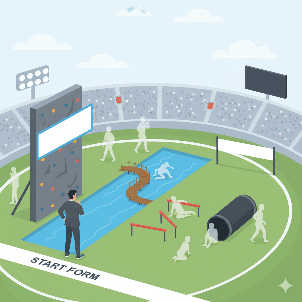
Don't make your Customers work! How "Unnecessary Effort" in a form Is costing you 18% of your leads
Excessive effort
Imagine you want to buy a coffee. You walk up to the counter, and instead of taking your order, the barista hands you a survey with questions like: "How did you hear about our café?", "Please describe your flavor preferences in three sentences," and "What is your address?". Absurd? Of course. And yet, this is exactly how many companies treat their customers in online forms.
Unnecessary effort is micro-friction that forces the user to do work that isn't essential to achieving their goal. It's all those fields and tasks that serve your convenience, not the customer's.
The data is ruthless: forms that impose additional conditions are abandoned 11% more often. And if filling out a field requires switching to another application (e.g., to copy a link), the abandonment rate jumps by a staggering 18%.
Here are the 5 most common examples of how companies make their customers do unnecessary work.
5 Examples of Unnecessary Effort in Forms
1. The "How did you hear about us?" question, aka Marketing Homework
- Scenario: A customer is ready to send a simple inquiry. At the end of the form, they encounter a mandatory dropdown field: "How did you find out about our company?".
- Why it's a problem: You're forcing the customer to stop and analyze their own customer journey. That's a job for your marketing department, not for them. The answer is often complex ("I saw an ad, then a friend recommended you, and finally, I Googled you"), so the customer just picks the first option available, skewing your data.
ProTIP: Want to track lead sources? Use UTM parameters and modern analytics tools that do it automatically in the background. Don't force your customer to do your marketing homework for you.
ProTIP: Avoid dropdown lists. They require at least three user actions (click to open, select, confirm). They are also particularly problematic to use on smartphones. Use radio buttons instead.
2. The "Website URL" field, aka Send your Customer on a trip
- Scenario: The form asks for the customer's company website address.
- Why it's a problem: This is a classic example of a task that forces the user to leave the form. The customer has to open a new tab, copy the URL, and paste it back. This is the exact moment when the risk of abandonment increases by that 18%. Besides, if you have the company name or the domain in their email address, finding their website will take you 5 seconds.
ProTIP: Shifting a task onto the customer that you could do yourself in seconds is a clear signal that you don't value their time. If this field isn't absolutely critical, remove it.
3. The "Describe your needs" field, aka Write us an essay
- Scenario: A contact form includes a large, empty, and required text box with the prompt: "Please provide a detailed description of your needs."
- Why it's a problem: This is the highest-effort task you can ask for. Instead of a quick contact, you're asking the customer to write a project brief. This is a huge barrier for people who are just exploring your offer or don't have time to craft detailed descriptions.
ProTIP: Instead of an open-ended text box, use a few option buttons (radio buttons) with the most common problems or goals (e.g., "Increase sales," "Improve Google visibility"). Also, provide an optional field like "Something else? Tell us briefly" to give freedom to those who want to write more.
ProTIP: If a customer does take the time to describe their issue, thank them for it and take it into account during your first conversation. The worst-case scenario is contacting the customer after they've submitted the form and asking about things they have already described in their message.
4. Repeating information, aka "Could you please retype this?"
- Scenario: In a multi-step form, the customer enters their name and email in the first step. In the final step, on the summary page, the form asks them to re-enter the same data for "confirmation."
- Why it's a problem: This is just malicious and proof of a poorly designed process. The customer feels that their previous effort has been ignored. It's frustrating and insulting.
ProTIP: A good form has a memory. Use technology that carries data between steps. If you need confirmation, simply display the data they've already entered and ask, "Does everything look correct?" instead of making them retype it.
5. Selecting a department, aka Do Our Triage for Us
- Scenario: A contact form includes a field "Choose the department you wish to contact," followed by a list: "Sales," "Marketing," "Technical Support," "Accounting."
- Why it's a problem: This is your internal organizational structure, which means nothing to the customer. They have a problem to solve and they don't know (and shouldn't have to know) who in your company is responsible for it. You're forcing them to guess.
ProTIP: It's your job to route the inquiry to the right person, not the customer's. Use a single contact email or a simple system that automatically assigns inquiries. Make the customer's life easier, not your employees' (at least at this stage). Most CRMs can automate this process based on the context of the query, without needing to involve the customer.
The Golden Rule: respect your Customer's time and energy.
Every field you can remove, remove it. Every job you can do for the customer, do it. Your form should be a well-oiled machine that requires the absolute minimum effort from the user to achieve their goal - contacting you.
Curious if your form might be hiding pitfalls? Let’s find out together! Reach out at contact@formdig.com
Wishing you a great day,
Marcin Przybyla