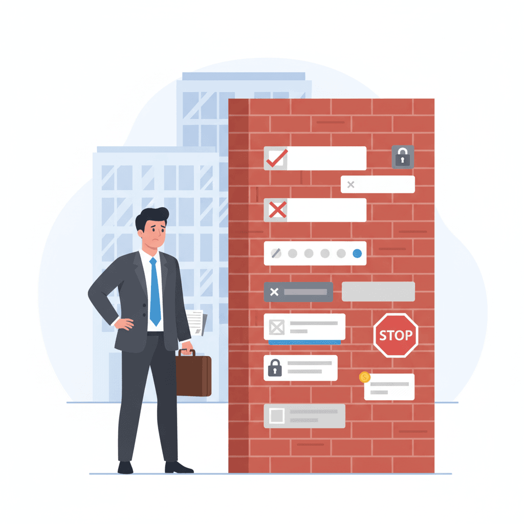
Process friction: the invisible wall costing You 48% of Your B2B Clients

Process friction
Have you ever stood in line at a government office for 30 minutes, only to be told you're at the wrong window and the correct form is in a room at the other end of the hallway? That feeling of wasted time, irritation, and discouragement - that's exactly what process friction in an online form feels like to your client.
It's one of the most insidious forms of micro-friction. It's not as obvious, but it's just as deadly. In short, it's every unnecessary second, every redundant field, and every illogical step that stands between an interested client and them clicking the "Submit" button.
Our data from FormDIG analytics shows this isn't a small problem - a full 48% of all form abandonments originate from process friction. It's an invisible wall that nearly half of your potential leads crash into.
Let's take a look at how this silent saboteur works in practice.
Examples of process friction in action
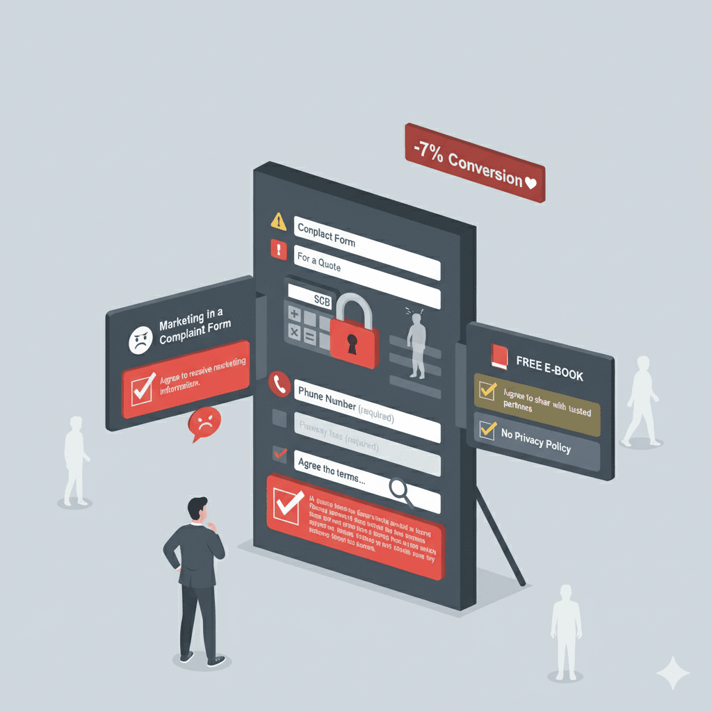
1. The interrogation form
A user clicks "Request a Quote," and what they see is... a wall of text. Fifteen fields to fill out: from a tax ID number and company registration number to a mailing address, job title, and favorite color. They feel like they're in an interrogation, not a business conversation.
- Why is this a problem? The first impression is overwhelming. Seeing the sheer amount of work required, many people give up before they even start.
- The data speaks for itself: Studies consistently show that the ideal length for a B2B form that ensures the highest conversion is around 5 fields. Every additional field drastically increases the risk of abandonment.
ProTIP: Your sales team doesn't need to know what brought a client to your site at this stage. They can ask that during the quoting process. The form's job is to make it easy for the client to get in touch, not to make it easy for your support team to handle them. Keep your priorities straight and eliminate all fields that aren't absolutely essential for making initial contact.
ProTIP: Avoid dropdown lists like the plague! First, they require at least three actions (click to open, select an option, confirm the choice), which significantly lengthens the process. Second, long lists are tricky on mobile. If you must use them, replace dropdowns with radio buttons.
ProTIP: If you really need to collect more data, create a multi-step form with a clear progress bar. Casual step names like "Almost there..." can be fine, just remember to match the communication style to your target audience so you don't overdo it.
2. The amnesia form
A client carefully fills out several fields. They click "Submit." The page reloads, and a red message appears at the top: "An error occurred in the form." Where? What's wrong? Who knows. Now they have to go back through all the fields, looking for their mistake.
- Why is this a problem? It's extremely frustrating and disrespects the user's time. The form isn't helping; it's just judging, and with a delay.
- A better solution: Real-time validation. As soon as a user types an incorrect email format, the field should immediately highlight in red with a message like, "Oops, a valid email address is needed here."
ProTIP: Reward the user for small successes, like correctly entering a phone number. A simple "checkmark" or a green border around the field. It's simple, but it feels good.
ProTIP: Remember to provide feedback. A clear confirmation that the form was sent is an absolute must-have. If the form included an email address, an automatic reply to the user's inbox confirming receipt and an expected contact date will do the trick.
3. The labyrinth form
The order of the fields is completely illogical. First, the form asks for project details, then a name, then back to project details, and finally an email. The user feels lost.
- Why is this a problem? A chaotic layout makes the form difficult to fill out smoothly and can suggest that the company's internal processes are just as messy.
- A better solution: A logical flow. Start with the simplest data (name, email), and then gradually move on to more detailed questions.
ProTIP: Always start with contact information (name, email, etc.). First, you always introduce yourself at the beginning of a conversation, right? Second, if the user runs into a problem and abandons the form, thanks to FormDIG, you already have their contact info and can reach out!
ProTIP: If you must qualify leads, leave it for the end. A good example is asking about the project budget—only add this if you're sure your target audience are pros and know what you're talking about. Even then, avoid dropdowns and open text fields. If you must, use radio buttons with 3-4 price ranges.
4. The ambush form
The user is halfway through when the form suddenly demands information they don't have on hand, like a previous invoice number, a scanned company document, or a contractor's tax ID. The process comes to a screeching halt.
- Why is this a problem? This sudden stop is incredibly frustrating. It forces the user to interrupt their task, search for information, and come back to the form later (or, more likely, never). The client feels like they've been ambushed.
- A better solution: Transparency from the start. If the process requires specific data, inform the user before they start the form. A short note like, "Before you begin, please have your last invoice number handy," can work wonders.
ProTIP: Under no circumstances should you place fields in sales forms that require the user to leave the form. Example: "provide your company's website address." Seriously, is that essential at this stage? Remember that the state a user is in while filling out a form is very delicate; they are deciding to invest their time and money. Don't knock them out of their flow!
ProTIP: If you ask the user for information you can easily find yourself in your databases (e.g., last order date, company address), you're sending a clear signal: "We can't be bothered; we're shifting the work onto you." Are you sure that's a good reflection of how you'll care for the client relationship in the future?
5. The expert form
The form starts simply, but suddenly asks a technical question the user can't answer. A form for a new website requires specifying the technology, a print shop expects a choice of printing technique, and a hosting company demands a server configuration. This blocks the entire process and makes the user feel incompetent.
- Why is this a problem? The form mistakenly assumes the person requesting the service is also a technical expert. It's a hard stop that forces the user to interrupt the process and seek help, and it presents the company as being out of touch with business realities where roles are specialized.
- A better solution: Flexibility and assistance. Add an option like "Please recommend the best option for me." Instead of testing the client, show that you're an expert ready to help, which immediately builds trust and makes it easier to move forward.
ProTIP: Don't ask these types of questions if you're not selling to specialists. Even then, think twice about whether you're using jargon that might be incomprehensible to them.
ProTIP: Avoid the option "I don't know," as it suggests ignorance and that the client should know. Instead, if you must, add an option like "Please provide a suggestion" or "Help me choose."
How to turn a labyrinth into a highway: simple ways to reduce friction
You don't have to revolutionize your form. A few strategic changes are all it takes to turn an obstacle course into a smooth highway to conversion.
1. Apply the "must-have" rule.
Every field in your form has a "price"—it costs the client time and cognitive effort. Open your form and divide all fields into two categories:
- "must-have": Information without which you absolutely cannot start a valuable conversation with the client (usually name, email, maybe the subject of the inquiry and phone number).
- "nice-to-have": Everything else. Questions that make the sales team's job easier but can be asked later ("How did you hear about us?", "Company size", "Project budget", etc.).
- Now, ruthlessly delete all fields from the second category.
2. Eat the elephant one bite at a time.
Instead of presenting everything to the client at once, break your form into 2-3 logical, short steps. The psychological principle of commitment and consistency is at play here. Once a user invests their time in completing the first simple step (like providing a name and email), they feel an internal need to finish what they started. The practical breakdown:
- Step 1: Just the basics. Ask for a name and email. That's it.
- Step 2: A few more details. Key questions about the purpose of the contact, related to the form's specific function, like "How can we help?"
- Step 3: Closing. A space for optional information and, of course, any consent checkboxes.
- An essential element: Always show a visual progress bar! The client needs to know where they are and how much is left. This gives them a sense of control and motivates them to complete the process. Note: Well-designed multi-step forms can increase conversion by up to 300%!
3. Be a guide (real-time validation).
Your form should be a helpful assistant that provides real-time guidance.
- Instant feedback: Let the user know immediately if a field is filled out correctly or not.
- Use positive reinforcement: A green "checkmark" or border on a correctly filled field is a micro-reward. It's a signal to the brain: "good job, keep going!", turning a boring task into a series of small successes.
- Helpful criticism: A red error message must be precise. Instead of "Invalid format," write, "Oops, the email address should contain an @ symbol." This is a specific hint, not just pointing out a mistake.
4. Avoid ambushes
- Manage expectations. If your process must require non-standard data (e.g., a contract number), inform the client before they start the form. A simple note like, "Please prepare X and Y," turns an ambush into a well-planned and professional process.
- Do your homework. Don't ask for data you can find yourself in 20 seconds (website address, NIP, REGON). Respect every second the client spends on your form and don't shift your responsibilities onto them.
- Don't interrupt the process. Don't ask for things that require the client to stop filling out the form and go somewhere else.
5. Don't fall in love with your own jargon.
Don't assume the person filling out the form (a manager, a purchasing department employee) is a technical specialist. Instead of making contact easier, you're scaring away valuable leads and making the client feel incompetent.
- Speak human. Ask yourself: "Would someone outside my industry understand what I'm asking?" If not, simplify the language or remove the field entirely. Communication should be tailored to the client, not your internal IT department.
- Be a guide. Instead of asking about the technology, ask about the goal the client wants to achieve. Instead of an "I don't know" option (which suggests ignorance), add a "Help me choose" button. This turns a roadblock into an opportunity to build a relationship and showcase your expertise.
Remember! Every removed field and every simplified step is a gesture toward the client. It's a message: "We respect your time." And in the B2B world, there is nothing more valuable.
Did you enjoy this post? If you'd like to see how your own forms stack up, write to us at contact@formdig.com
Have a great day! Marcin Przybyla